Accounting and finance are categories where brands often look very similar. Formal language, conservative typography and muted colours are common.
Lichmann needed to feel professional and credible, without falling into the same pattern.
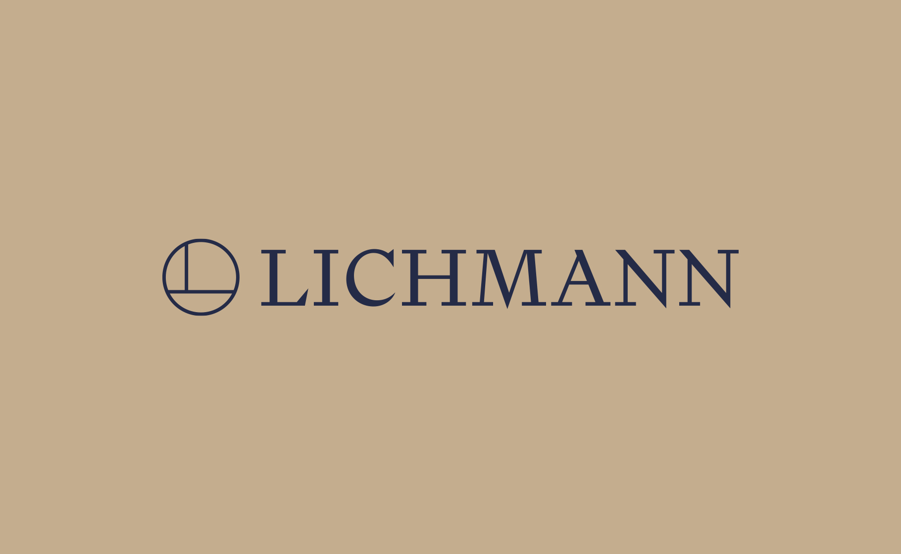
I decided to build the brand around simple elements. The mark is understated, while the identity is built around two typefaces: a serif and a sans-serif.
The serif gives the brand more character and a sense of experience. The sans-serif keeps things simple and clear. A distinctive colour palette completes the identity, giving it a more elegant and contemporary feel.
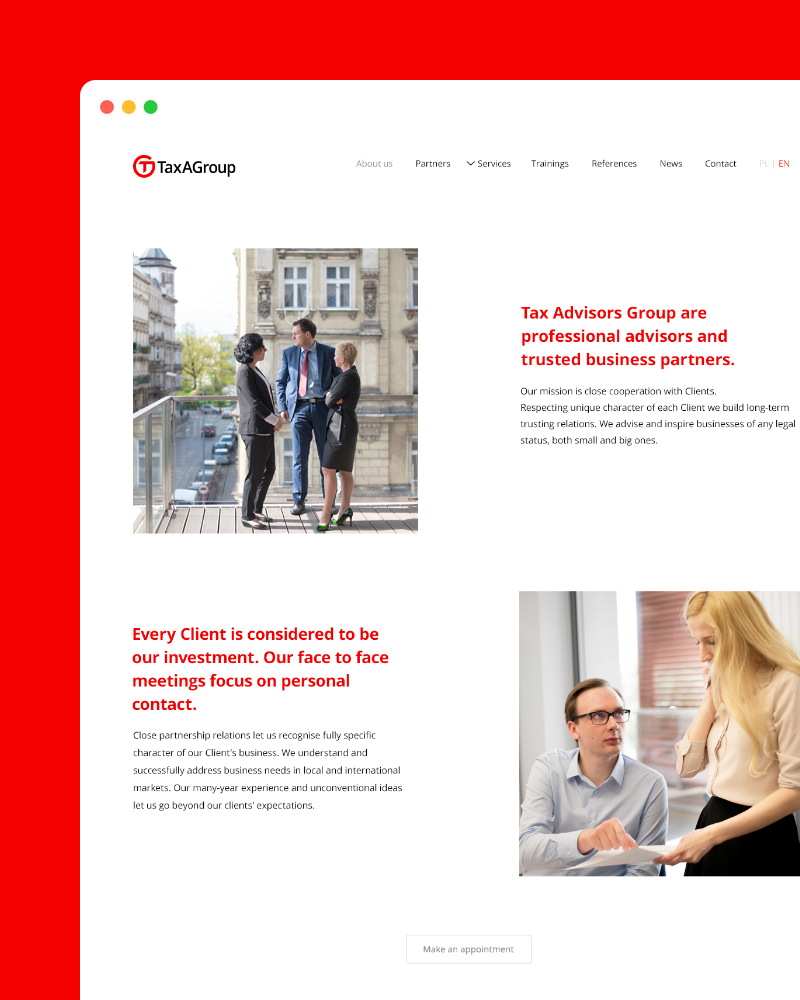
I carried the same language into the website, where a simple layout and typography keep the focus on what matters.
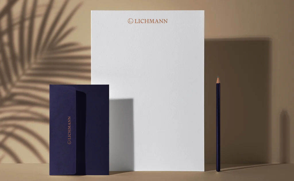
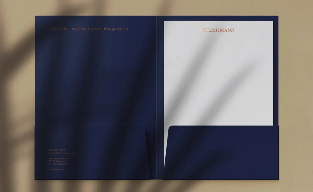
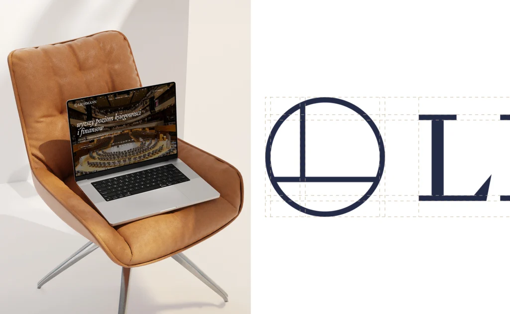
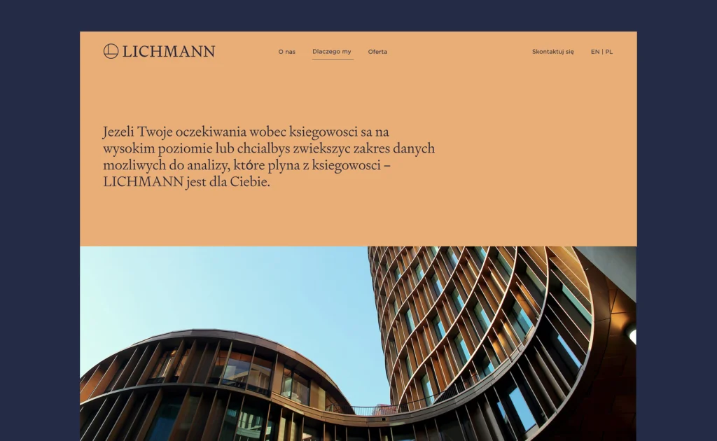
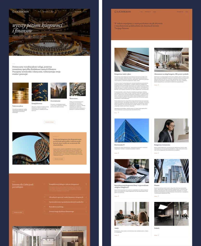
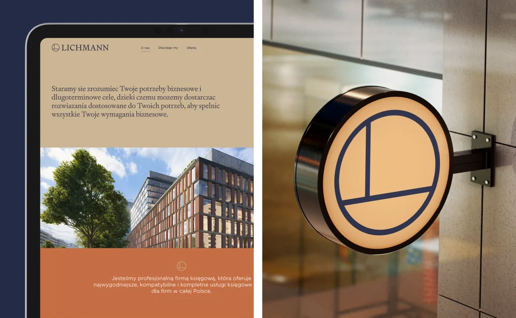
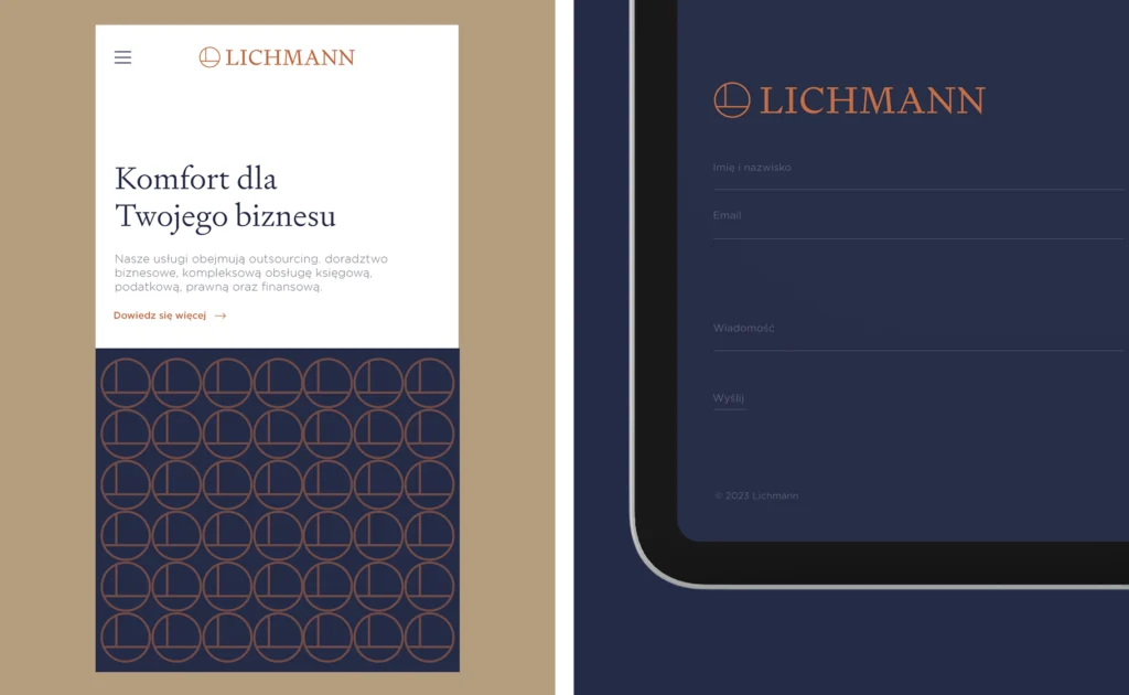
A simple, distinctive brand that stands out in a conservative category while remaining professional and credible.
The identity and website create one consistent visual language, offering a more contemporary and approachable way to talk about financial services.