TestArmy was growing quickly, gaining more experience and taking on increasingly demanding clients. As the company developed, its brand needed more structure and a clearer direction.
The identity needed to present TestArmy as a modern and trustworthy technology company, working with major brands and responsible for the quality of their websites and applications.
The starting point was the name itself. Rather than building the identity around the usual visual associations with technology and testing, I focused on its more distinctive part: “Army”.
I combined the letter T with a star referencing the military character of the name. The idea was expressed in a simple, more technological way, avoiding a literal representation of an army.
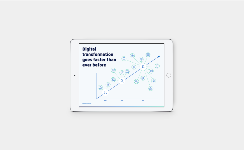
From there, I built the wider visual system. I selected the colour palette and typography and created a set of layouts that made it easier to develop new materials. A library of icons and illustrations was also created for use across the company’s communication.

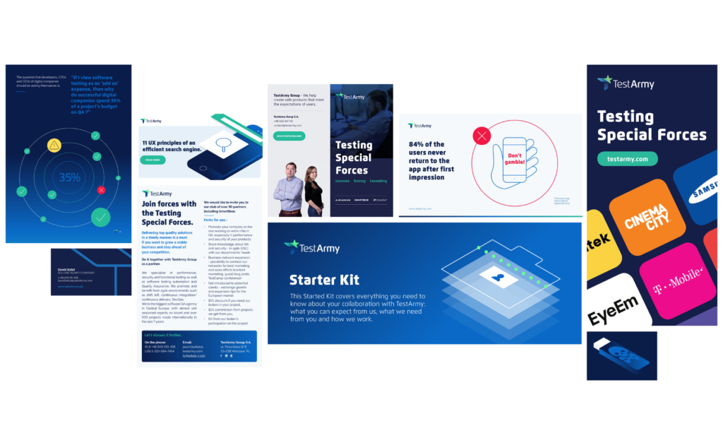


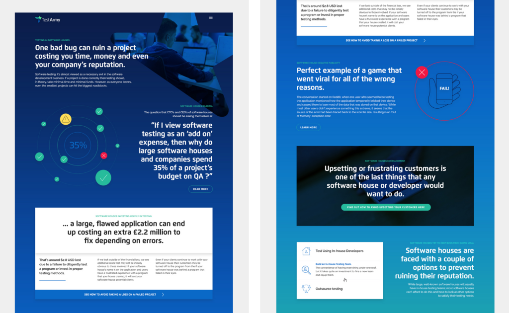
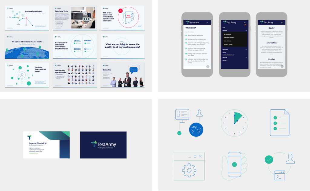
The name TestArmy became the starting point for a distinctive identity built around associations with an army: discipline, preparation, specialisation and readiness to act.
The new brand helped TestArmy establish a stronger position in the market. The company went on to take on larger projects and work with bigger organisations, with its continued growth eventually leading to an investment.