Tax Advisors Group had years of experience and a strong position in the market, but its visual identity did not reflect it. The company worked with some of the largest businesses in the region and was regarded as one of the leading firms in the market.
The brand needed a visual identity that matched the position the company had already earned.
The bigger the company, the less it needs to say to make an impression. I decided to keep the identity simple and focused on a few strong elements.
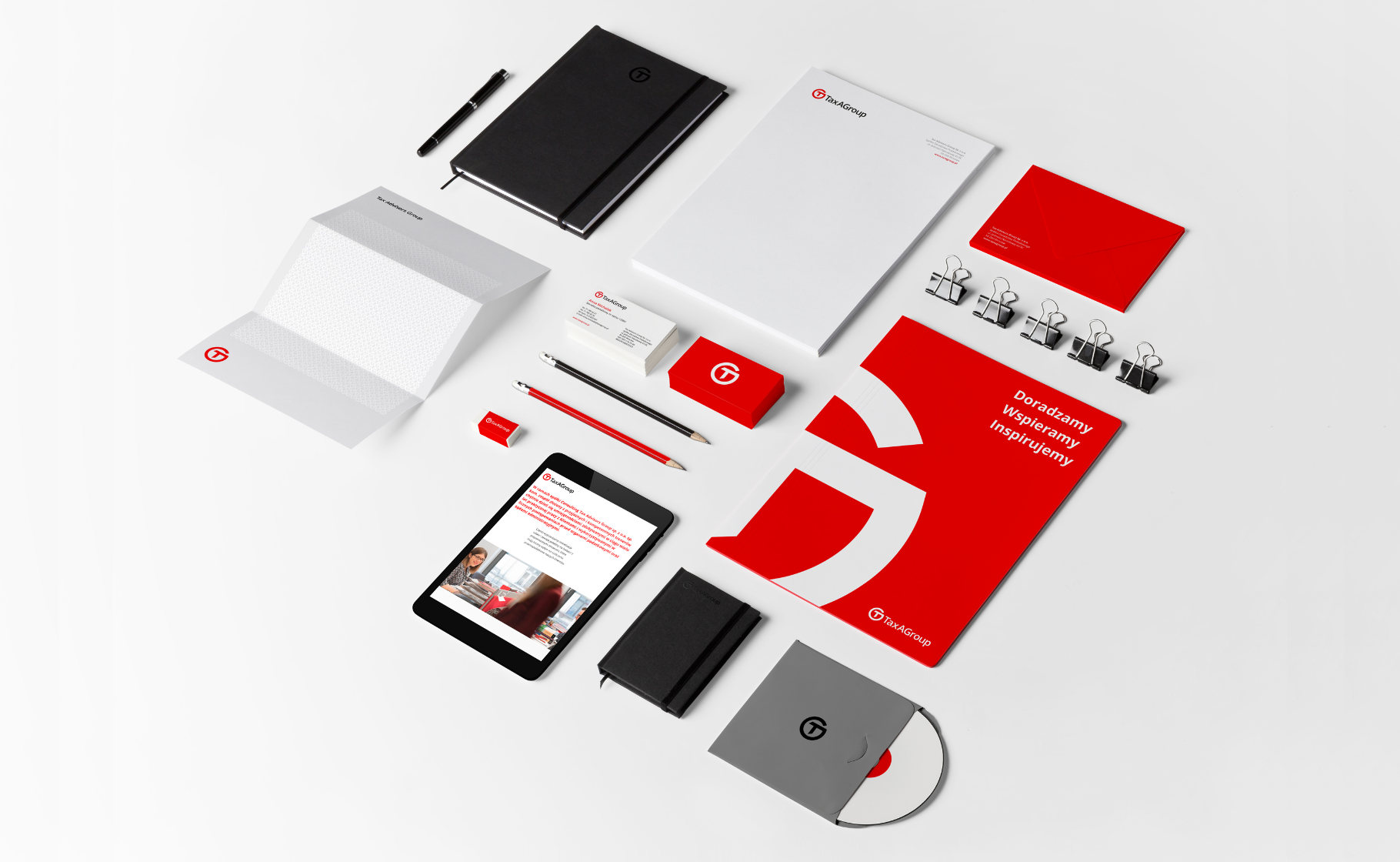
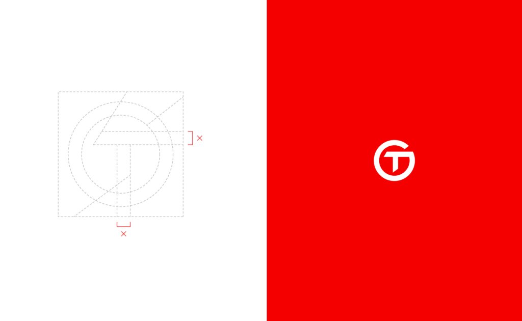
The name TaxA became the starting point. I combined the letters T and G into a monogram that was simple, strong and easy to recognise.
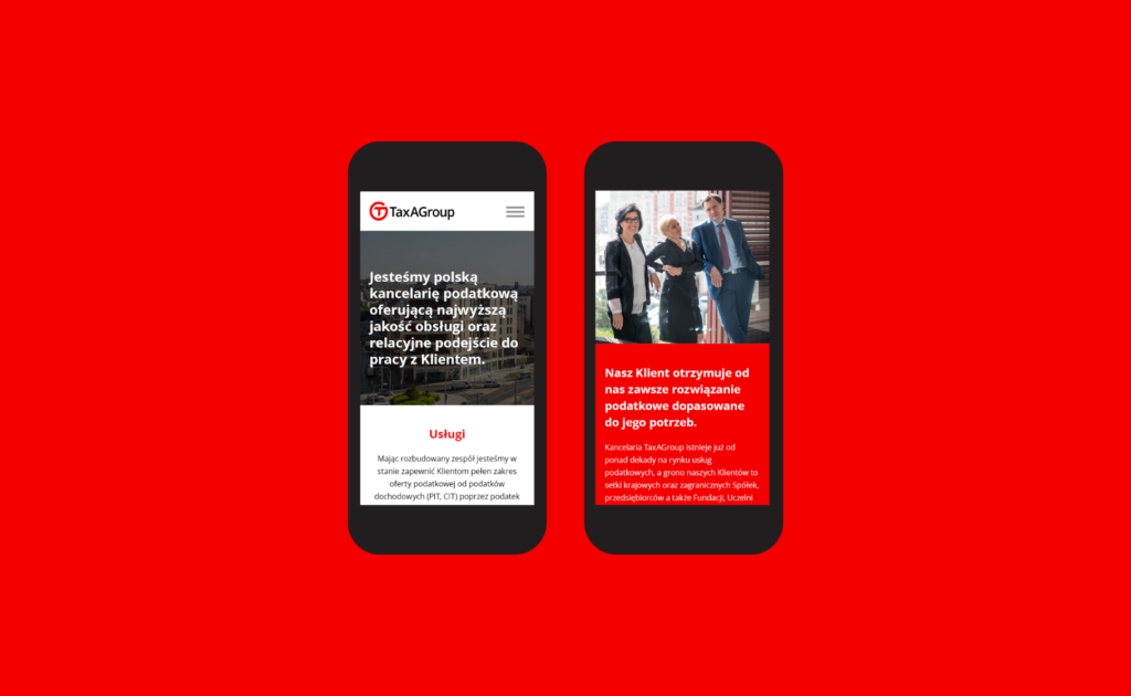
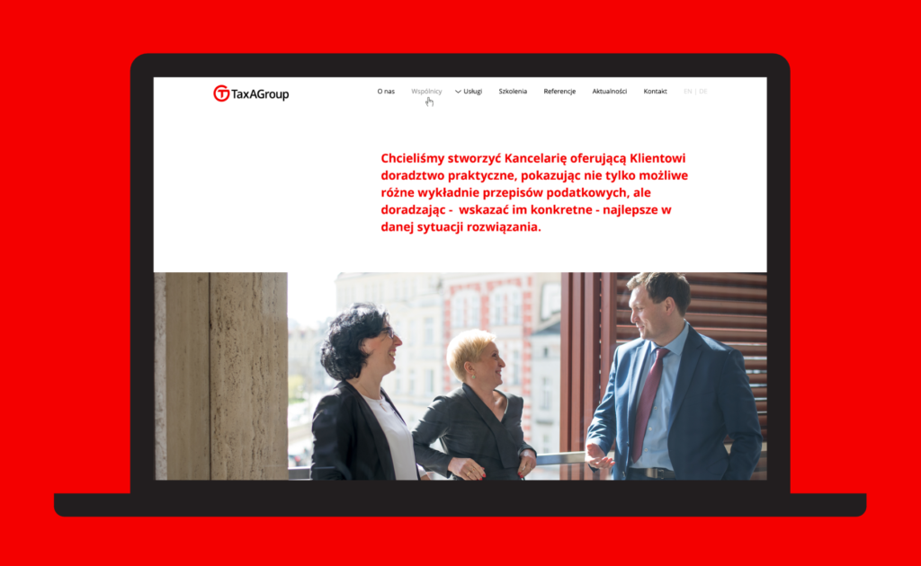
The rest of the identity was deliberately restrained. One colour, simple typography and photography became the main building blocks. The website was based on a clear grid, with photography showing the people behind the company as well as its connection to Wrocław.
The project was developed closely with the client and a team of designers, from the initial mark through to the wider communication system and website.

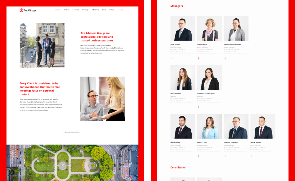

The new identity gave Tax Advisors Group a visual presence that better reflected its position and experience.
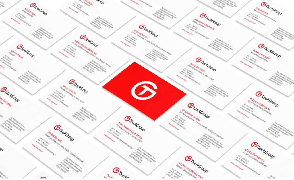
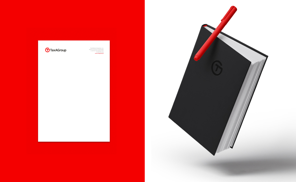
The monogram became the strongest element of the identity, while the limited number of visual elements made the brand clear and consistent across different materials.
The website was also recognised by Dziennik Gazeta Prawna as one of the most user-friendly websites in the business advisory category.