Verstiuk had grown beyond the kind of work where an attractive animation was enough. The studio was taking on larger and more demanding projects for major companies, while its own identity had not quite caught up.
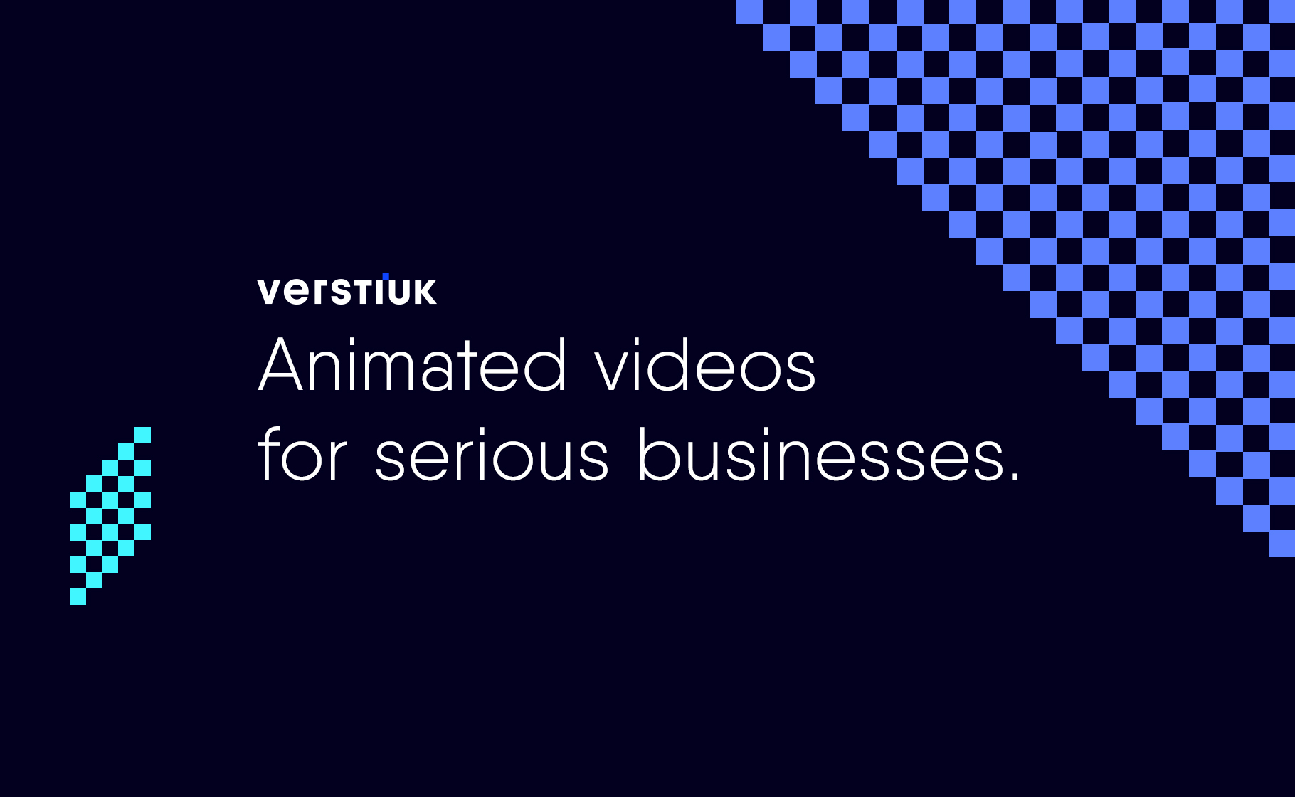
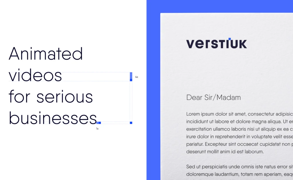
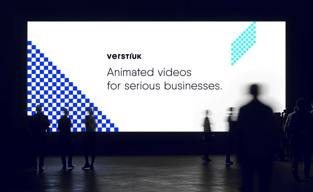
The new tagline, Animated videos for serious businesses, captured this change well. Animation was still at the heart of the brand, but it also needed to communicate experience, quality and a clear understanding of how video can work for business.
The brand needed more structure and definition, without losing what felt natural for an animation studio: colour, energy and a sense of play.
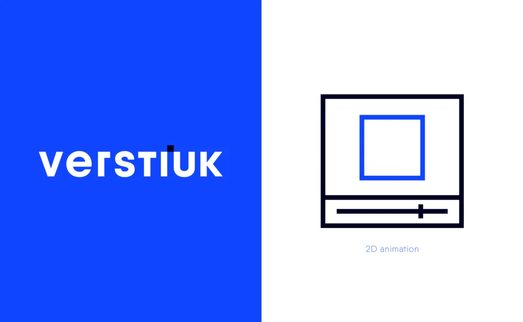
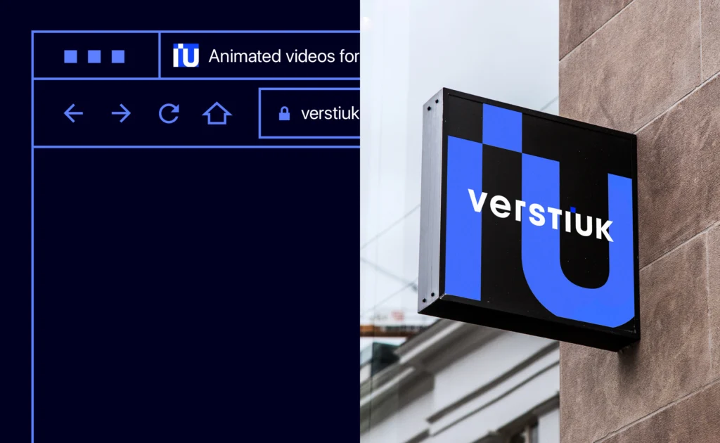
The starting point was the logo itself. I treated the dot above the “i” as a single pixel. It was a simple element, but it felt right for a studio working in a world where every animation begins with an image made up of pixels. The pixel then became one of the defining elements of the identity.
I built the visual system around it. A strong colour palette brought energy to the brand, while one leading colour helped keep it recognisable. Simple typography and clear rules balanced the more expressive elements.
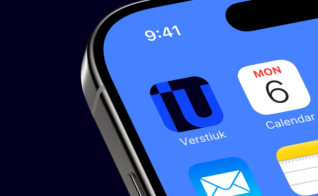
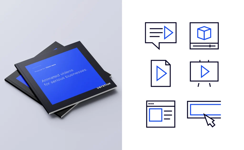
I also designed a set of custom icons to represent the studio’s services. Everything was brought together into a straightforward system that could be easily applied across different materials and developed alongside future projects.
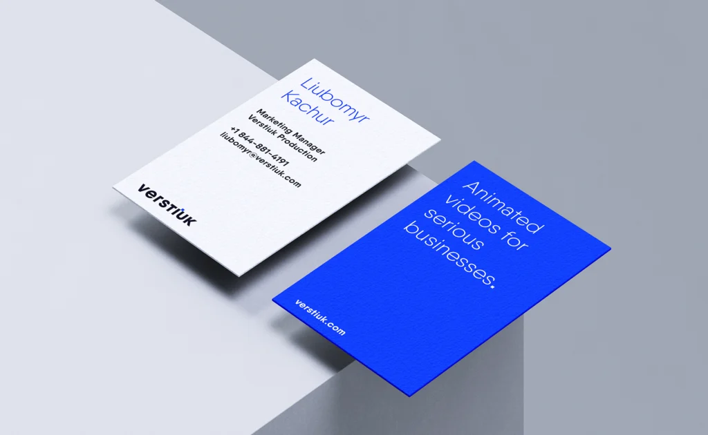
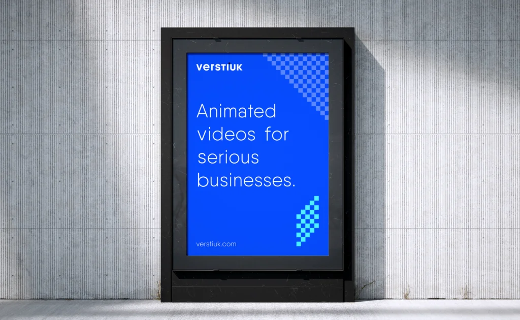
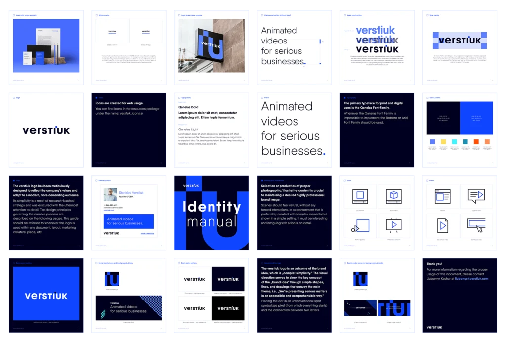
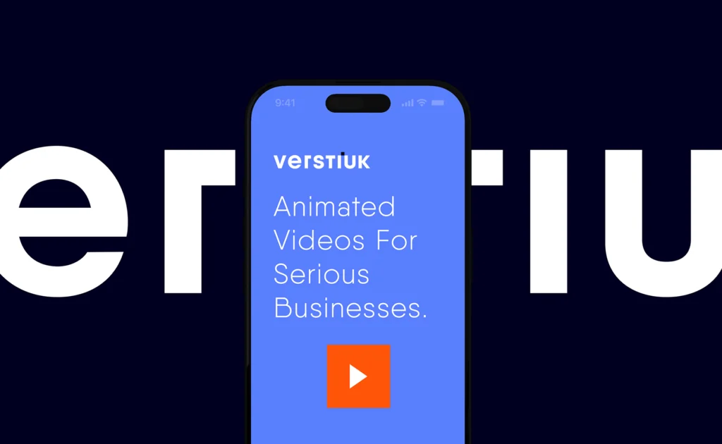
The new identity better reflects Verstiuk’s position and the direction in which the studio is growing. It is more structured and distinctive, while still feeling connected to the world of animation.
The dot above the “i” became a simple, recognisable element that could be used in different ways, from the identity itself to materials connected with video production.