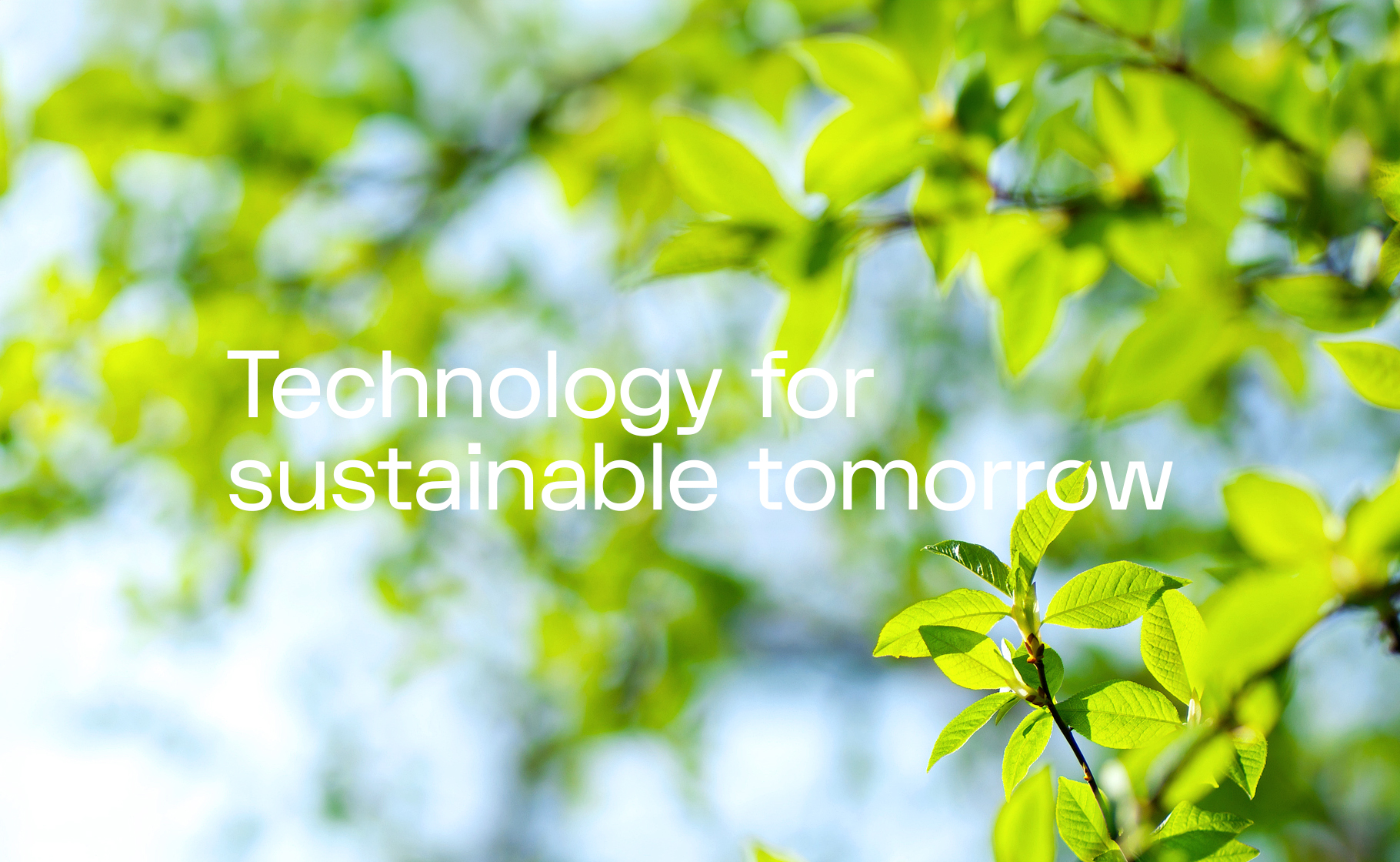
The company already had an established brand, but as it grew and expanded into new markets, it needed a visual system that could work across the different areas where the brand appears. At the same time, a new business strategy called for a more organised identity and website.
After getting familiar with the brand, I noticed several areas where the number of elements could be reduced – including the extensive colour palette and the large number of patterns assigned to individual products.
The idea was to strengthen what was already working and give the brand a clearer direction that would be recognisable as Volue. Until then, individual products had their own identities, which made the overall brand feel less consistent.
The next step was to move away from patterns and find a different way to communicate Volue’s technological character. I introduced three photography categories that highlighted the company’s Scandinavian roots while showing its work in a more human and natural way.
People and nature became central to the visual communication. After all, energy is meant to serve people, and technological development should go hand in hand with care for the environment.
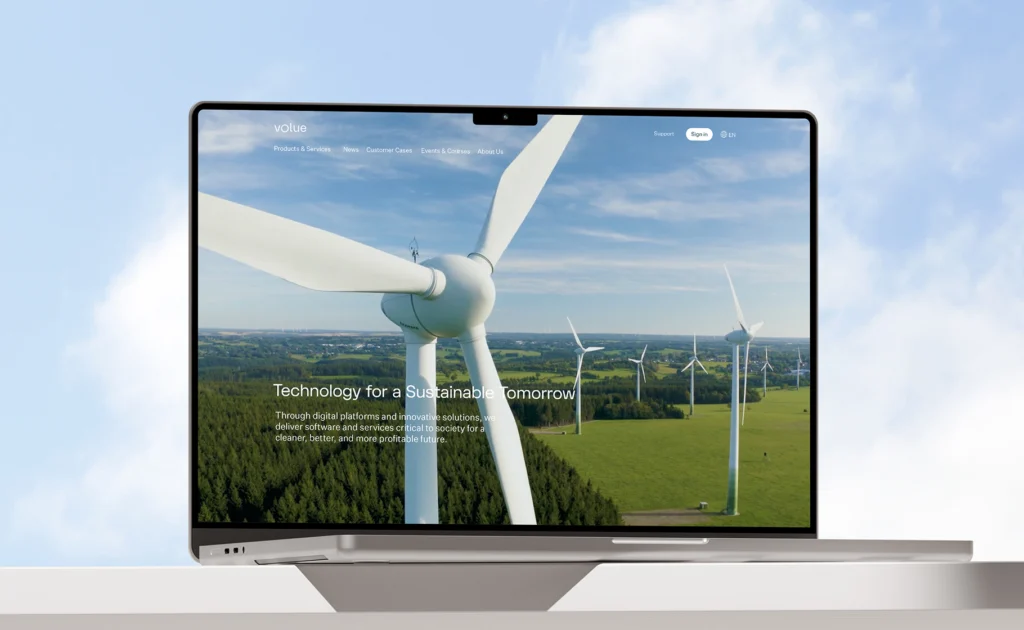
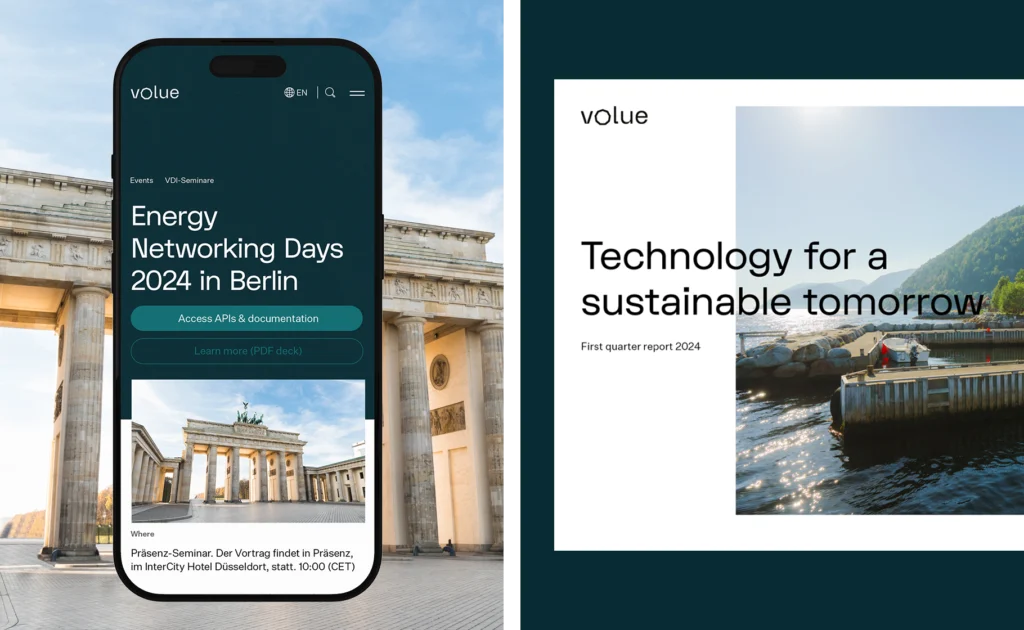
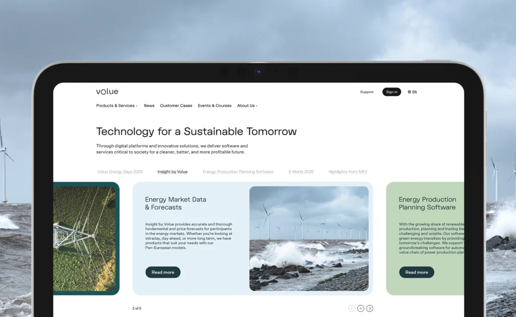
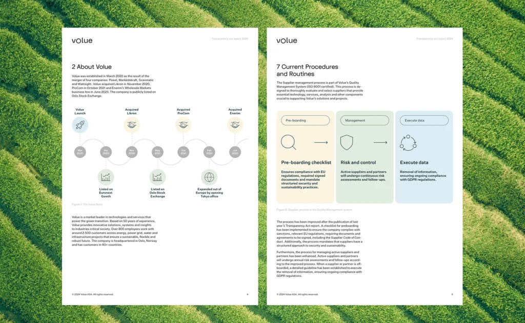
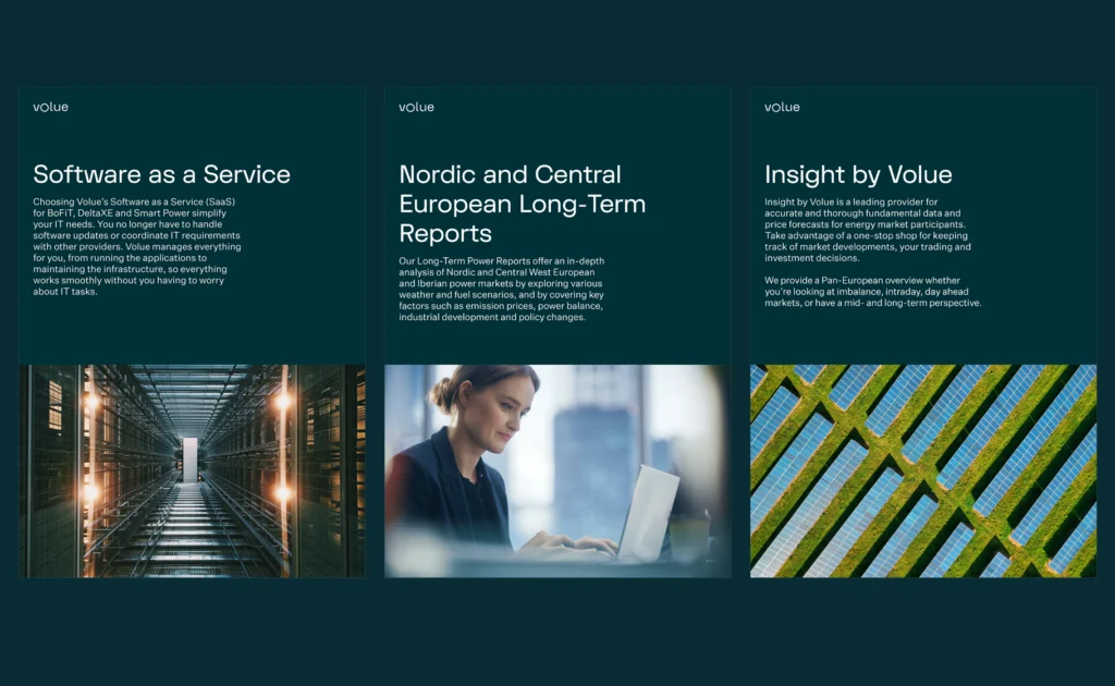
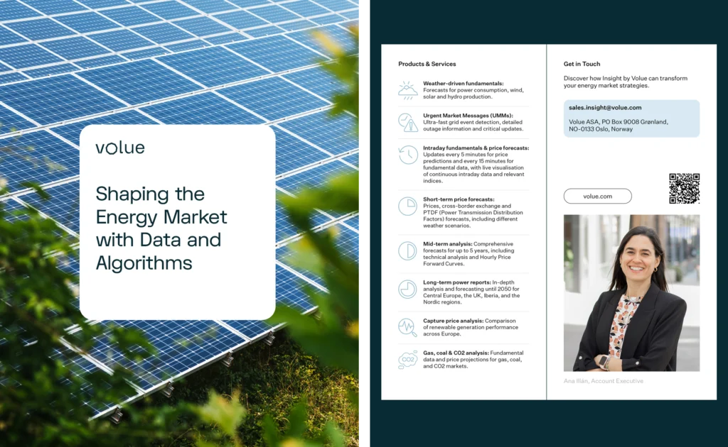

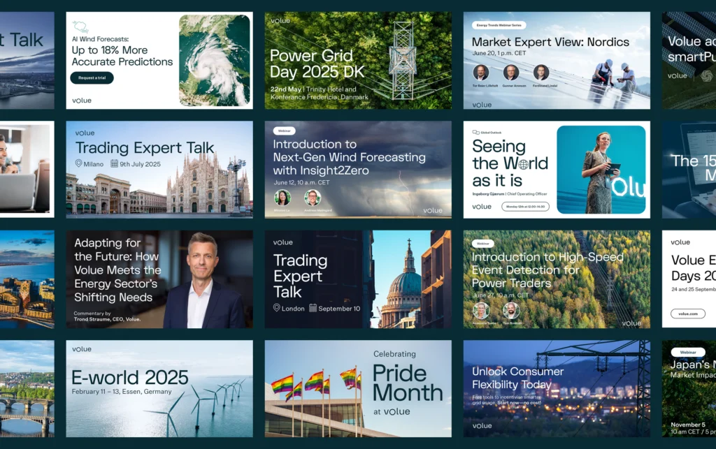
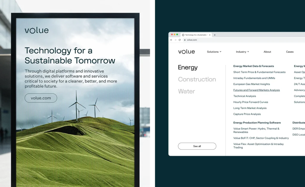
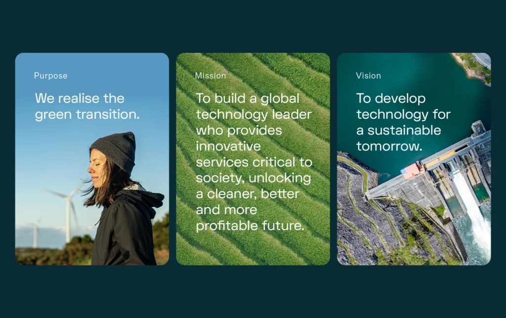
The brand gained a consistent and distinctive visual language – modern, while still recognisably Volue. The system is flexible enough to support consistent communication across different channels and markets, while allowing individual products to retain their own character.
Most importantly, Volue gained one shared visual direction that better reflects the character of the company, its Scandinavian roots and the role of technology in building a better future.